After almost 2 months of waiting and practicing tableau at every chance I could get, on Thursday afternoon the much anticipated DS15 Stage 3 email arrived! I took the time to read it over, including an interesting and very useful article from founder Tom Brown. Moving on I opened the ominous ‘’data set’’. I scanned over it to see what made sense right of the bat… if anything. Once identifying the key factors, the large data set was going to require a lot of filtering and grouping so I set about scribbling down some ideas for ways of doing this.

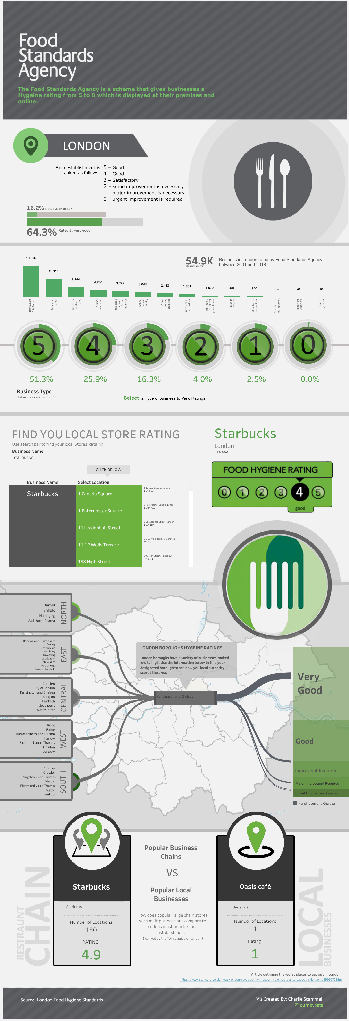
I also landed on the idea that an info-graphic viz may be the way to go. However before opening tableau I went into the Food Standards Agency (FSA) website using the link provided to do a little research and understand the goal of the FSA. The FSA is a
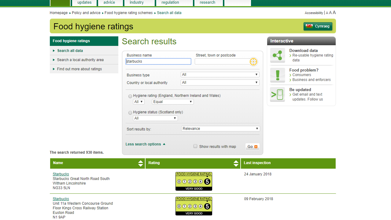
scheme that gives businesses a rating from 5 to 0 depending on the cleanliness of their establishment. After a thorough reading of the website I came across their rating finder. I felt it could have been made a little clearer if all the information was shown at once/ or with a scrolling option rather than spread over multiple pages.
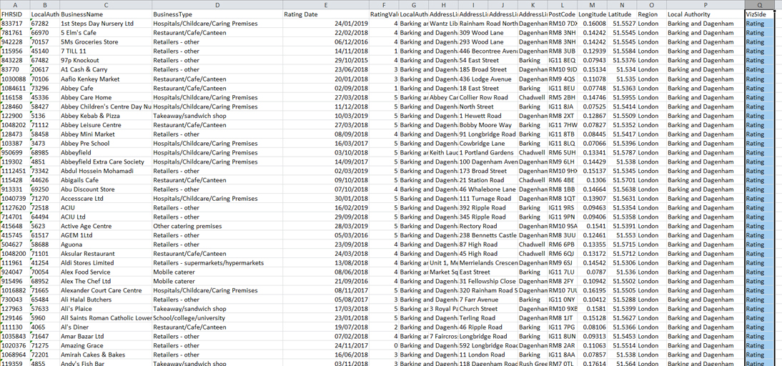
Once I felt that I had a good understanding of the data it was time to transfer it into tableau. Here I done a quick check for any patterns or abnormalities, I didn’t expect to find any it’s just habit. I came to the conclusion that the three main categories
of the data that should be highlighted in this viz where Business type, Local Authorities, and the FSA Ratings.
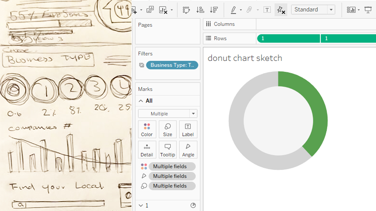
To set about this I decided to show what percentage of each individual type of business was rated from 0 – 5. Using a donut chart for each value I converted the rating value to a dimension and set it as percentage of the total number of records (Locations), allowing the viewer to simply select a business type and have all the information synced.
Now that I had a few aspects to add to my viz I began by designing a layout that would be appropriate for this the type of data set. One idea that stood out early on was that I was going to use the green from the FSA logo and rating card and incorporate that into the colour scheme and design of the viz. I also noticed green to be a common colour scheme for public info sites, taking inspiration from sites such as trip advisor and enterprise car hire. I made a mock up viz based off of initial drawings and luckily I began to like the design, so unlike many, many! other projects I’ve done in the past I landed on my design early on.
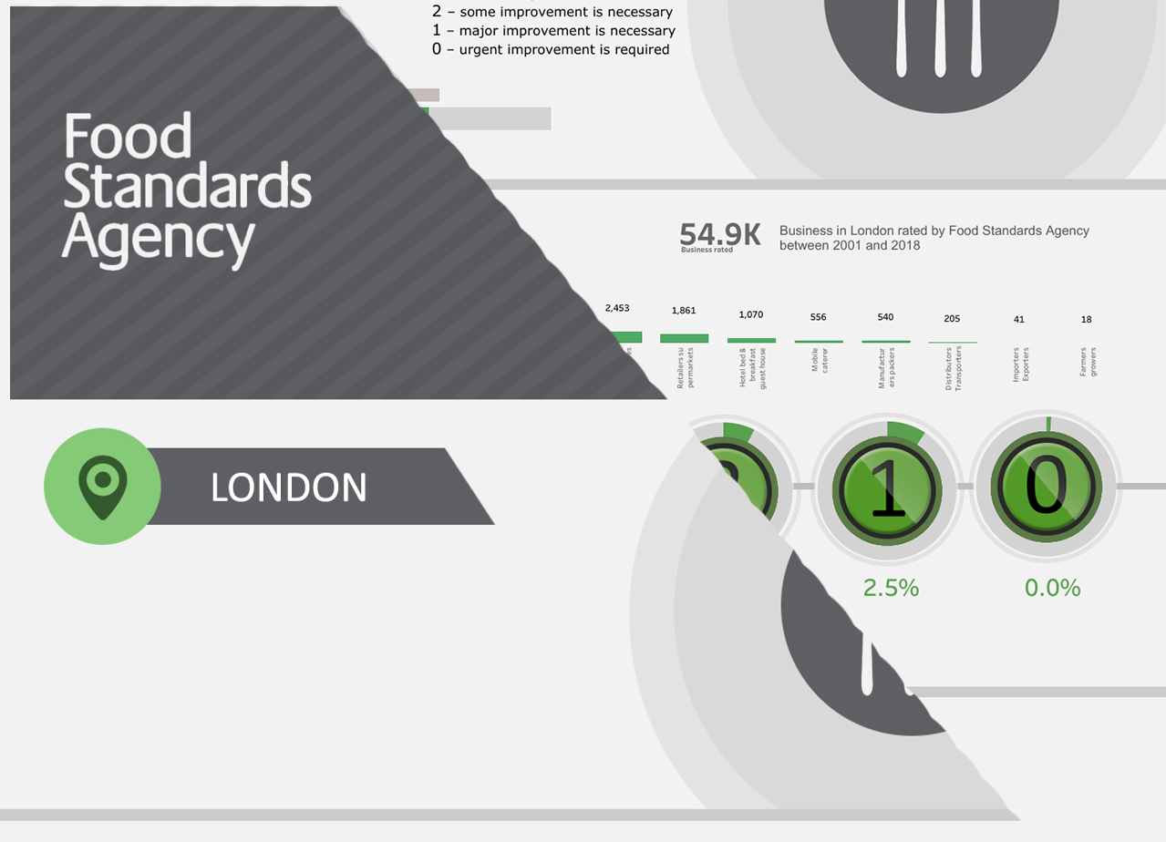
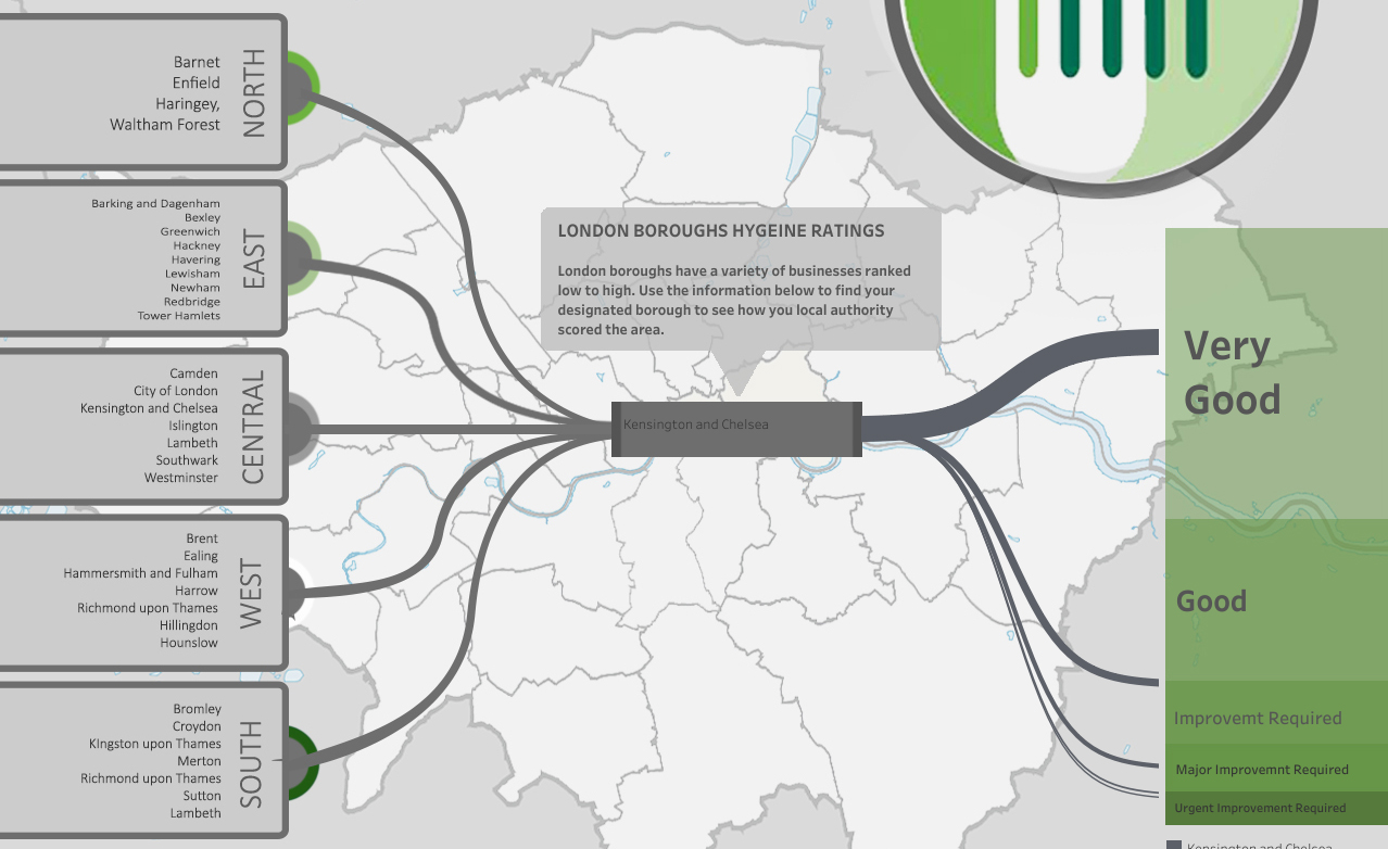
Now I had my overall design I wanted to flesh it out with as much relevant information as possible. Not being from London I done some quick research of local authorities and the areas of London to familiarise myself as much as possible with the data subject. I found that the local authorities applied to the individual boroughs of London. This was a great help for my next step.
My initial plan was to create a Sankey diagram (a chart I have began playing around with), however without being able to supplement the data, as stated in the rules, I couldn’t group the boroughs together to NORTH, SOUTH, EAST, WEST and CENTRAL as planned. Without this it would make a Sankey diagram too overcrowded to be useful, so I countered this by using yet another filter system and simply visualised the area of London boroughs.
My process for this was:
First Initial problem: The newly updated Tableau 2019.1 doesn’t support legacy connections. To overcome this I took the data into excel and manually duplicated it and filled out rows for side 1 and 2 of the chart.
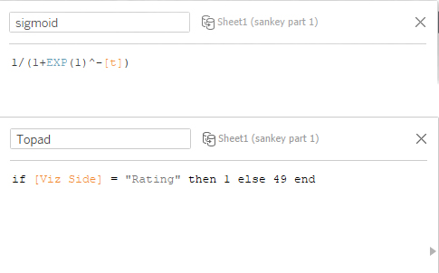
I went about the initial calculations as a standard Sankey diagram only leaving all values on the left side the same, hoping that when the ‘Sigmoid’ equation was entered the chart would simply over lap the starting point.
Thankfully this worked and I was able to use a standard filter to show each individual boroughs path with a colour coding aspect to try bring the whole chart together.
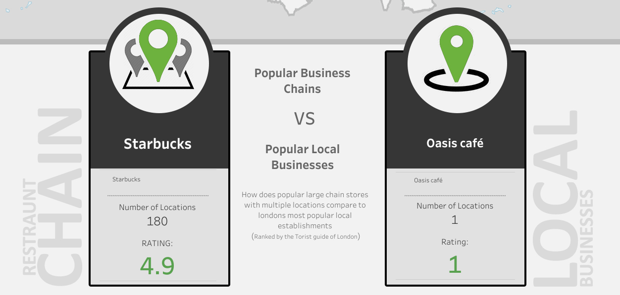
From the little research I could do myself of asking friends and family what they would find interesting. A common question that got asked when discussing the goal of the project, was “are the smaller local businesses cleaner than big chains?” one example was a quote from a friend “I would rather sit in to eat in say a café rather than a mcdonald’s”. So I guess the people had spoken, I was somehow going to incorporate a comparison element between chain stores and local businesses.
I hit a wall with not having any values to break the data up into those categories – in hind sight possibly a calculated field converting locations with a higher number of records to ‘Chain Stores’ was a possibility – but still being new to tableau I simply researched the most popular local eateries in London and also most popular UK food chains. Then created two separate sheets using edited filters
A few tweaks and changes later and I had finally landed on a viz I was happy with.
I still have a few days left until my interview date so no doubt there are a lot more tweaks and changes to come. To summarise, the past few days have been a balance of stress and over thinking, but overall have been fun and satisfying, and I can safely say this has been the quickest weekend of my life. It’s now Sunday night and I feel like I opened the data set only yesterday.
